Transforming a School’s Digital Presence to Strengthen Trust, Clarity, and Enrollment
Project Overview
Client: Escola SOS Ilha
My Role: UX/UI Designer + Creative Lead
Project Duration: 6 weeks
Year: 2023
Tools: Figma, Adobe XD, Photoshop, Notion, Google Analytics
The Challenge
SOS Ilha is a respected educational institution in Rio de Janeiro, but their digital experience was outdated, unclear, and difficult to navigate. Parents struggled to understand programs, requirements, and pricing; communication channels were inconsistent; and the website did not reflect the school’s values or credibility.
The school needed a modern, trustworthy, conversion-focused digital platform to increase inquiries and enrollment while making information accessible for parents and students.
Goals
-
Improve clarity of information and reduce parent confusion
-
Create a UX flow that supports enrollment and onboarding
-
Modernize the visual identity and layout
-
Reduce friction in navigation and key decision points
-
Strengthen credibility and trust through a professional structure
Research & Insights
To understand the challenges, I carried out:
-
Stakeholder interviews (administrators and teachers)
-
Conversations with parents about main frustrations
-
Evaluation of competitor school websites in Rio
-
UX heuristic review of the current website
-
Analysis of content gaps and message clarity
Key Findings
-
Parents felt lost and overwhelmed with long text blocks and unclear sections.
-
Enrollment information was available but difficult to find.
-
Mobile experience was inconsistent and hurt trust.
-
The school’s friendly, community-oriented personality was not visible in the design.
-
Parents wanted faster access to WhatsApp, schedules, and pricing.
These insights shaped a redesign that prioritized simplicity, emotional clarity, and straightforward decision paths.
Strategy
I focused on creating a structure that answered the most important parent questions quickly:
1. Simplified Information Architecture
-
Reorganized content into intuitive sections
-
Reduced redundant pages
-
Improved headings and logical grouping of information
2. Clear Enrollment Flow
-
Step-by-step explanation of enrollment
-
CTA placement for WhatsApp and forms
-
Shortened the path from landing to contact
3. Trust + Emotional Connection
-
Added photos, values, and mission
-
Highlighted safety and learning structure
-
Introduced consistent brand colors and educational visual tone
4. Mobile-First Approach
-
Designed layouts to look clean and legible on mobile
-
Reduced scrolling fatigue using modular blocks
Design Execution
Wireframes & Iterations
Early low-fidelity wireframes focused on organizing the content and solving navigation issues. After feedback, I iterated with:
-
Larger typography
-
Cleaner spacing for parents reading quickly
-
Stronger visual hierarchy
-
Clear CTA buttons with direct WhatsApp flow
Final UI
The final design features:
-
A calm, trustworthy color palette
-
Modular sections with clear headings
-
Parent-focused explanations
-
Simple enrollment steps
-
Responsive components for all device sizes
It communicates what matters most: clarity, safety, and trust.
Impact
After publishing the updated design:
-
Parents reported feeling more confident understanding the school’s offerings
-
Internal staff received fewer repetitive questions
-
WhatsApp inquiries became more qualified
-
Navigation time decreased noticeably
-
Users quickly located key information such as calendar, values, mission, and enrollment steps
Growth Impact & Lead Generation
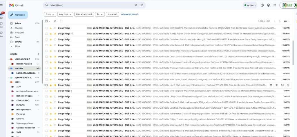
During this project, I not only improved the UX of the SOS Ilha website, but also took full ownership of lead generation and campaign performance. Through a combination of Meta Ads testing, UX updates, and clearer enrollment flows, I was able to generate a high volume of qualified leads for the school.
To handle the increasing demand, I even built a small Python automation script that contacted new leads instantly — improving response time, engagement, and conversion into in-person visits.
The combination of UX optimization + paid acquisition + automation helped SOS Ilha reach families more efficiently and maintain a consistent flow of interested parents. I will include the screenshot of the leads below to illustrate the scale of this activity.
What I Learned
This project strengthened my ability to:
-
Translate emotional concerns of parents into UX decisions
-
Communicate complex school information in simple, visual language
-
Balance business goals with user clarity
-
Build trust through clean structure and thoughtful design choices
Role & Responsibilities
I led the entire UX/UI process:
-
User research and content analysis
-
Information architecture
-
UX flows and wireframes
-
High-fidelity UI design
-
Visual branding refinements
-
Client communication
-
Implementation guidance
Tools Used
-
Figma – Wireframes & UI
-
Adobe XD – Mockups & prototype
-
Photoshop – Image adjustments
-
Google Analytics – Understanding user behavior
-
Notion – Research organization & documentation

